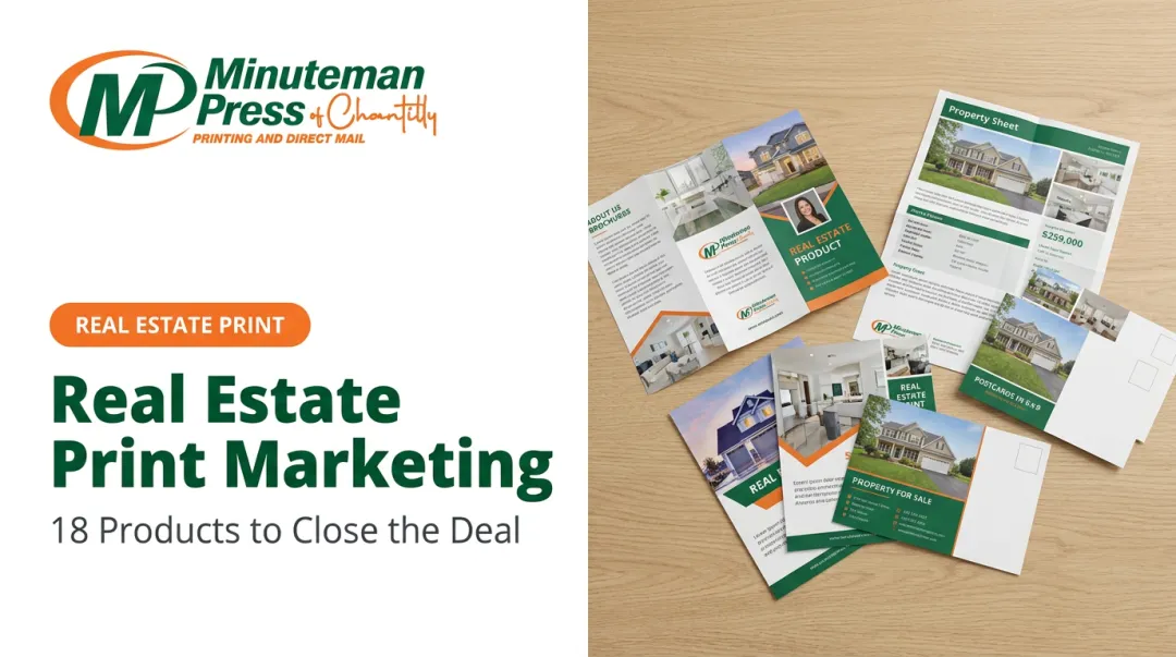
NAR's 2025 Generational Trends Report found that 83% of buyers rated listing photos as "very useful," with detailed property information close behind at 79%. That tells you what buyers want to see — but it doesn't guarantee they'll find it if your layout buries it.
This article walks through a practical, step-by-step process for highlighting the details that drive decisions, the design tools that make those details land, common mistakes that undermine even well-designed brochures, and how to adjust your approach based on property type.
Key Takeaways
- Rank details by buyer decision-making order before you open any design tool
- Use visual hierarchy — size, weight, spacing — to control where a reader's eye lands first
- Bullet points, callout boxes, and bold typography outperform paragraphs for individual property specs
- Color contrast and white space are functional tools, not decoration
- Paper stock and finish determine how well your highlighted elements actually appear in print
Step-by-Step: How to Highlight Key Details in Your Real Estate Brochure
Step 1: Identify the Details That Deserve Emphasis
Not all property information carries equal weight. Before touching any design tool, list every potential detail and rank it by how directly it influences a buyer's decision:
- Price — the first filter for most buyers
- Location and neighborhood — NAR reports neighborhood quality as a top selection factor for 59% of buyers
- Bedroom/bathroom count and square footage
- Standout features — chef's kitchen, outdoor space, recent renovations
- Open house date or showing instructions
- Agent contact information and CTA
The critical discipline here: limit "hero details" to 3–5 per panel or page. When you try to emphasize everything, you emphasize nothing. Visual competition between bold headlines, colored callout boxes, large photos, and underlined CTAs collapses the hierarchy entirely.
Step 2: Build a Visual Hierarchy Before Placing Content
Visual hierarchy means sizing and positioning elements so the reader's eye follows a deliberate path from the most important element down through supporting details. For print layouts, the Z-pattern is a reliable starting framework: readers enter at the top left, scan across, drop diagonally, and exit at the bottom right. That exit point is where your CTA and contact block belong.
Apply a clear three-level structure:
- Level 1 (largest, boldest): Property headline, price, or hero image
- Level 2 (mid-weight): Subheadings, feature callouts, square footage, key specs
- Level 3 (smallest): Body description, neighborhood context, fine details
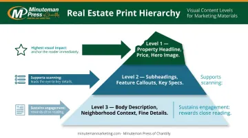
Never introduce a fourth level. A fourth tier doesn't add nuance — it just muddies what you've already built.
Step 3: Use Typography to Direct Attention
Bold text, larger font sizes, and high-contrast colors are the most direct way to make a price point or key feature stand out. A few rules that hold:
- Stick to two font families (one for headlines, one for body text). Decorative or script fonts slow reading and reduce clarity.
- Minimum 12pt body text for print readability, per RNIB clear print guidance; 14pt is preferable for wider legibility
- Use dark-on-light contrast for key details — black or dark brand color on white or cream backgrounds reads fastest
For individual specs like square footage, bedroom count, and nearby schools, bullet points and icon-paired text outperform paragraph prose every time. A buyer scanning a brochure at an open house will register "4 bed / 3 bath / 2,400 sq ft" in a formatted line far faster than the same facts buried in a sentence.
Step 4: Apply Color and White Space Strategically
One accent color pulled from the agent's or brokerage's brand palette , can function as a powerful highlighting tool when applied sparingly. Use it for:
- The listing price
- A headline feature callout box
- The CTA button or block
Apply that accent color to four or five elements per page and it stops being a highlight. It becomes background noise.
White space works the same way. Generous margins and spacing around a key detail signal to the reader that this element deserves attention. Research published in the Journal of Consumer Research frames white space as meaningful open space in visual rhetoric, not empty area. Crowding a panel removes that signal entirely.
Step 5: Position CTAs and Contact Information for Maximum Visibility
CTAs ("Schedule a Showing," "Call for a Private Tour") and contact details should land where eyes naturally exit the page : typically the bottom right or the back panel. Set them in a visually distinct block:
- Contrasting background color (your accent color or a dark field)
- Bold agent name, phone number, and email in large, readable type
- A QR code linking to the listing, a virtual tour, or a scheduling page
The QR code serves two purposes: it bridges print and digital, and it lets you track how many people engage with the brochure after leaving an open house.
Design Elements That Make Property Details Stand Out
Beyond the step-by-step process, several specific design components act as highlighting tools on their own.
Callout Boxes and Feature Strips
A formatted "Property Highlights" strip — listing 4–6 key specs in a clean, boxed section — is typically the most-read section of any real estate brochure. Buyers scan for it instinctively. A well-structured strip might include:
| Spec | Detail |
|---|---|
| Price | $875,000 |
| Bedrooms / Baths | 4 bed / 3 bath |
| Square Footage | 2,450 sq ft |
| Lot Size | 0.35 acres |
| Year Built | 2018 |
This format requires no reading. It rewards scanning.
High-Quality Photography as a Highlighting Mechanism
A full-bleed hero image on the cover acts as a visual anchor that highlights the property's strongest selling point before a single word is read. It also frames every other detail on the page: a compelling price line next to a poor photo loses credibility, while the same price next to a sharp exterior shot feels substantiated.
81% of buyers consider listing photos the most important factor when evaluating properties, according to NAR. That priority doesn't disappear when buyers hold a brochure instead of scrolling a listing page.
Paper Stock and Print Finish
Design decisions made on screen only deliver their intended effect if the print quality supports them. Bold accent colors, crisp typography, and vivid photos behave differently depending on the stock you print on:
- Glossy finishes (Heavy Gloss Cover 111# or Gloss Cardstock 130#) intensify color contrast and make photography appear sharper — the right choice for most listings and particularly effective for luxury properties
- Matte finishes reduce glare and create a refined, readable texture better suited to text-heavy or understated designs
- Silk/satin finishes offer a middle ground — rich color reproduction with an elegant, non-reflective surface ideal for premium branding
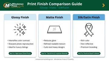
Minuteman Press of Chantilly offers nine paper stock options — from 65# satin to 16PT silk cardstock — printed using modern offset printing technology at 300 dpi. For real estate brochures where color accuracy and sharp typography matter most, the Heavy Gloss Cover 111# is a practical starting point. No minimum order quantity means you can print a single brochure or a full open-house run without committing to bulk.
What to Prepare Before You Design Your Brochure
Preparation determines the quality of what you can actually highlight. Before opening any design tool, gather:
- Professional property photos (exterior, hero interior, key rooms)
- Finalized listing price
- Confirmed specs: square footage, bed/bath count, lot size, year built
- Neighborhood and amenity notes
- Agent headshot, contact details, and brokerage logo
- Brand assets: colors, fonts, any existing style guidelines
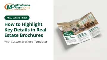
Agents short on design time can start with pre-structured, customizable brochure templates — Minuteman Press of Chantilly offers trifold and other listing brochure formats already built with visual hierarchy, headline levels, and organized spec sections. The trifold format, for example, separates exterior features, interior showcase, and quick-reference specs across three 8.5x11 panels.
Before sending anything to print, verify every highlighted detail for accuracy. A prominent, boldly displayed error — wrong price, transposed phone number, incorrect square footage — does far more damage than the same mistake buried in body copy.
Common Mistakes When Highlighting Key Details
Even well-designed brochures fall flat when emphasis is applied carelessly. Watch for these four common pitfalls:
Overcrowding emphasis. When bold headlines, colored callout boxes, hero photos, and underlined CTAs all compete on the same panel, hierarchy collapses. Limit strong emphasis techniques to two or three elements per page.
Low-contrast color combinations. Yellow on white, red on orange, light blue on cream — these pairings make highlighted details harder to read, not easier. Test combinations before finalizing, and default to dark text on light backgrounds for any critical detail.
Burying key details in prose. A detail bolded inside a sentence still loses most of its impact. Price, square footage, and standout features should live in callouts, bullets, or standalone stat blocks — not embedded in paragraphs.
Ignoring digital use cases. Many buyers photograph brochures at open houses or receive them as PDFs. If your highlighted elements rely entirely on print-specific contrast or paper finish, they may not survive a phone photo or a PDF viewed on a small screen. Test your layout as a standard PDF before your print run.
Tailoring Your Detail Highlights by Property Type
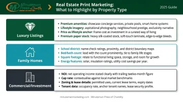
Not every property sells the same way — and neither should its brochure. The details you highlight need to match what that specific buyer is actually scanning for.
Luxury listings should lead with premium amenities and lifestyle imagery — pool, chef's kitchen, custom finishes, indoor-outdoor living spaces. Coldwell Banker Global Luxury reports that indoor-outdoor living remains a top priority for more than 60% of luxury specialists. Price still appears prominently, but it frames a lifestyle rather than anchoring the page. Paper choice matters here too: 130# gloss or silk cardstock signals the quality of the property itself before a word is read.
Family home brochures should front-load the three filters most family buyers apply first. NAHB research confirms that buyers consistently rate the following features as essential or desirable:
- School district and proximity to schools
- Square footage and bedroom/bathroom count
- Laundry room, patio, and garage storage
- Energy Star windows and efficiency features
Feature strips or a quick-scan spec block give family buyers exactly what they need — fast.
Commercial and investment property brochures operate on different logic entirely. These buyers prioritize location, zoning, square footage, and return metrics. Callout boxes should feature NOI, cap rate, lease details, and any relevant tenant data — not lifestyle photography. A commercial brochure without a cap rate prominently displayed is missing its most important number.
Frequently Asked Questions
What are the most important details to highlight in a real estate brochure?
Price, location, bedroom and bathroom count, key standout features, and a clear CTA with contact information. These are the details buyers filter on first, so they should be the most visually prominent elements on the page.
How do you make property features stand out on a printed brochure?
Bold typography, an accent color callout box, a bullet-point feature strip, and adequate white space around key details are the most effective tools. Each directs the reader's eye without requiring them to search for information.
What is the 3-3-3 rule in real estate?
The term has no single universal definition. For brochure design, the practical takeaway is this: limit strong emphasis to roughly three key details per panel so no single element gets diluted by competition.
Should you use bullet points or paragraphs in a real estate brochure?
Bullet points and short stat blocks for all discrete specs — price, square footage, features, nearby amenities. Reserve short paragraphs for property descriptions or neighborhood context, where a sentence or two of narrative adds genuine value that a list cannot.
What is a catchy phrase for real estate?
Effective headlines reflect the property's single strongest selling point: "Move-In Ready," "Backs to Protected Parkland," "Priced Below Appraised Value," or "Walk to Everything." Generic phrases like "Your Dream Home Awaits" generate less response than specific, factual hooks.
What are the 7 P's of marketing in real estate?
Product, Price, Place, Promotion, People, Process, and Physical Evidence. Physical Evidence is the most directly relevant here: a professionally printed brochure on quality stock signals how an agent represents their listings before a single spec is read.