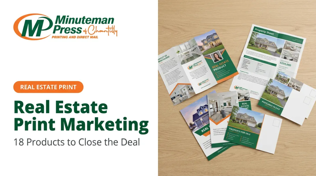
Introduction
When a buyer considers a $2M property, they don't make that decision in a single scroll. They deliberate, revisit, consult partners, and return to materials repeatedly over days or weeks. A luxury real estate brochure — held in hand, passed across a kitchen table, or left with a financial advisor — exists in that decision-making process in ways a digital listing simply cannot.
Digital marketing dominates volume. But for properties where the national 90th-percentile luxury threshold sits at $1.22M and ultra-luxury transactions in the DC area surpassed 100 deals above $5M for the first time in 2025, the physical object carries its own signal. A flimsy flyer suggests a budget listing. A weighty, beautifully finished brochure signals a premium property, before a buyer reads a single word.
Most agents know brochures matter. Fewer know what separates one that accelerates a decision from one that ends up in the recycling bin. This guide covers what to include, how to design and produce them, which materials justify the premium, and how to get them in front of the right buyers.
Key Takeaways
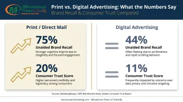
- Print achieves 75% unaided brand recall vs. 44% for digital advertising — a decisive edge where buyers spend weeks evaluating options
- A brochure's physical quality functions as a direct proxy for the property's quality and the agent's professionalism
- Essential elements: hero photography, property specs, lifestyle narrative, floor plan, and contact details
- Premium covers require 130 lb.+ card stock; soft-touch lamination and spot UV are the top finishes for luxury tier
- QR codes bridge print to 3D tours and virtual walkthroughs without cluttering the design
Why Luxury Real Estate Brochures Still Work in 2026
The Psychology of High-Value Decisions
Luxury buyers don't impulse-purchase. They spend weeks evaluating properties, loop in architects and attorneys, and return to materials multiple times. A brochure accommodates this multi-touchpoint process in a way that a Zillow listing — buried under hundreds of competing results by the next morning — simply cannot.
The memory science backs this up. Canada Post's neuromarketing study, conducted with True Impact Marketing using EEG and eye-tracking, found 75% unaided brand recall for direct mail versus 44% for digital advertising.
Separately, research from Temple University and the USPS confirmed that physical ads create stronger memory encoding and emotional response than digital counterparts — meaning a well-designed brochure doesn't just get seen, it gets remembered.
That recall advantage compounds with trust. Kantar's research found consumers trust offline media channels at roughly 20% versus 11% for online channels — a gap that matters when buyers are scrutinizing every detail of a multi-million-dollar decision.
The "Staying Power" Advantage
A luxury brochure doesn't disappear when someone closes a browser tab. It sits on a coffee table, gets handed to a spouse, passed to an interior designer for a floor plan review, or tucked into a folder with financial documents. On average, physical marketing pieces stay in a household for weeks — long enough to resurface at every stage of a purchase decision that often involves three to five stakeholders.
Compare that to digital listings: they vanish in scroll feeds, require active searching to relocate, and compete with every other property in the same database. Once a brochure is in a buyer's hands, it faces no algorithm, no competing listing, and no expiration date.
The DC metro market makes this case concretely — UrbanTurf reported that DC-area homes priced $2.5M–$5M exceeded 800 transactions in 2025, up 12% from 2024. In that environment, differentiated presentation isn't optional.
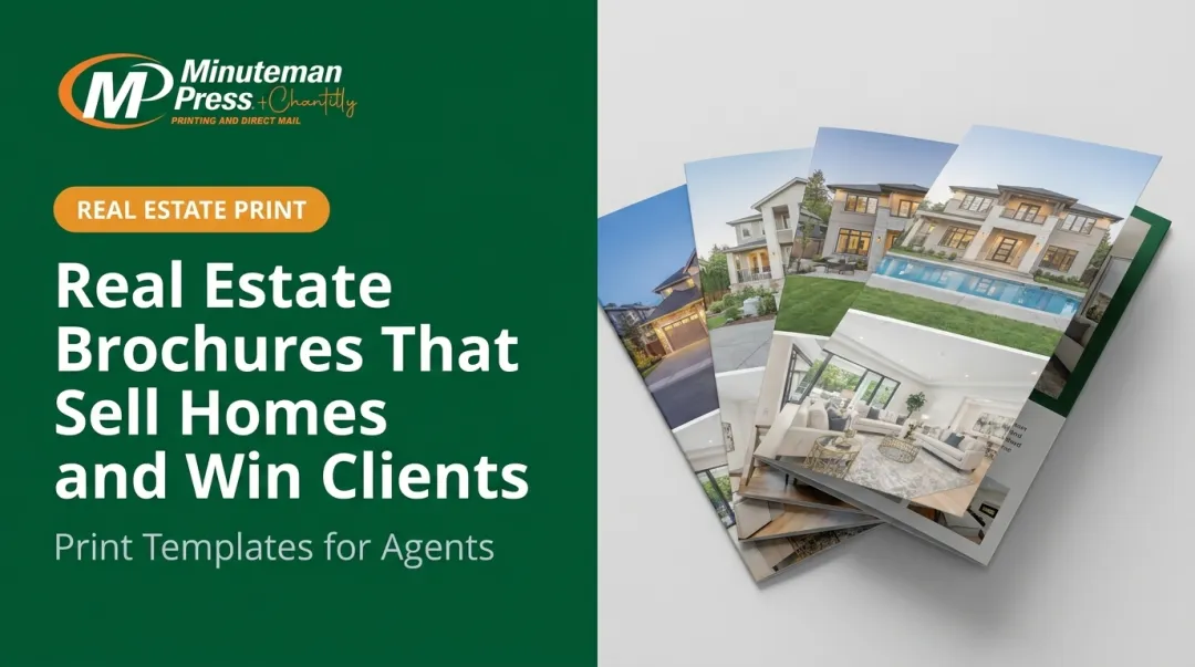
Essential Content Elements of a Luxury Real Estate Brochure
The Cover Page
This is the most valuable real estate in the entire piece. It should contain:
- One breathtaking hero photograph — the property's most striking exterior, infinity pool, or standout interior space
- The property address or neighborhood name
- A minimal headline that conveys prestige, not urgency
What it should not contain: price, square footage, or aggressive sales language. The cover earns attention; the interior sells.
Property Highlights
Specificity is everything here. Generic language reads as filler; precise details signal authenticity and justify a premium price point. Include:
- Bedrooms, bathrooms, square footage, lot size, year built
- Architectural or design distinctions: custom millwork, smart home systems, chef's kitchen specifications, imported stone or tile
- Construction materials and notable craftsmanship details
Lifestyle Narrative
Luxury buyers aren't just purchasing square footage. They're purchasing a version of their life — and this section makes that connection explicit. Highlight the elements that define daily living around the property:
- Proximity to private schools and universities
- Access to golf courses, country clubs, and yacht clubs
- Nearby cultural venues, fine dining, and arts districts
- Commute access and airport proximity
- The character and exclusivity of the surrounding neighborhood
Christie's International Real Estate built an entire magazine around this principle, pairing extraordinary properties with lifestyle content for exactly this reason.
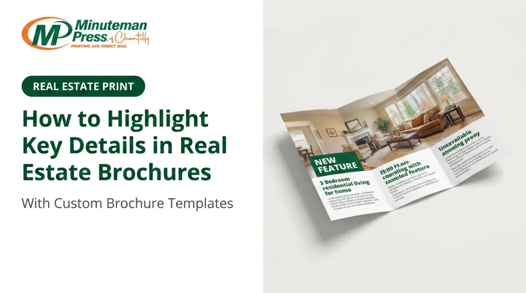
Floor Plan and Room Dimensions
High-net-worth buyers often arrive with architects or interior designers in tow, or consult them before visiting. A professional floor plan — clearly drawn, dimensionally accurate — makes the buying process easier and signals transparency. Without one, buyers and their advisors are left estimating — which rarely speeds up a decision.
Agent Profile and Call-to-Action
The back cover or final spread should include:
- Professional headshot
- Brief bio emphasizing luxury market experience and credentials (CLHMS designation from the Institute for Luxury Home Marketing, for example)
- All contact channels: direct phone, email, website
- Clear instructions for booking a private showing
Design Best Practices for a Luxury Feel
Typography
Serif typefaces signal heritage and quality. Monotype research found that 80% of elite fashion brands use serif typefaces in their logos — and the same principle applies directly to luxury real estate brochures. Garamond, Didot, and Playfair Display are the industry standards for this market.
Rules to follow:
- Maximum two typefaces per brochure
- Maintain strict hierarchy: large headline, medium subheadings, small body copy
- Never use decorative or casual fonts for body text
Color and Photography
The most effective luxury palettes center on black, deep navy, champagne gold, and white. Each color earns its place: black projects power and exclusivity, white delivers refined simplicity, and gold accents — especially as foil — register as unmistakably premium. When agent or brokerage brand colors are involved, the goal is integration, not competition. Keep brand accents restrained against a clean editorial background.
Professional photography is the single highest-return investment in any luxury brochure. Redfin's research found that homes photographed professionally sold about three weeks faster and fetched over $10,000 above listings with amateur photos. For a luxury listing, the floor is:
- Wide-angle interior shots with professional staging and lighting
- Drone aerial photography
- Twilight/dusk exterior shots
- Neighborhood lifestyle imagery
All images must be minimum 300 PPI at final print size. Adobe's official Photoshop documentation confirms 300 pixels per inch as the industry standard for high-quality print reproduction.
White Space
White space is a luxury signal, not wasted paper. Overcrowded layouts read as budget materials — the kind of brochure a prospect sets aside rather than keeps.
The editorial aesthetic of Architectural Digest or Robb Report isn't accidental. Generous margins, breathing room between sections, and restrained copy communicate quality through what's left out. If a layout feels "full," that's a design problem worth solving before print.
Premium Print Materials and Finishes
Paper Stock
The weight of a brochure communicates quality the moment someone picks it up. For luxury production:
| Component | Recommended Stock |
|---|---|
| Cover | 130–160 lb. card stock (silk or gloss) |
| Interior pages | 100 lb. silk or gloss text |
Minuteman Press of Chantilly offers premium paper options including 130# Silk Cover, 130# Gloss Cover, and 16PT C2S Silk — all positioned for luxury marketing materials. These are noticeably heavier than the thin stock used in standard real estate flyers — and buyers register the difference immediately.
Specialty Finishes
Not every finish needs to be used. Restraint is part of luxury. The most effective options:
- Soft-touch/velvet lamination — creates a warm, velvety tactile experience; the finish most associated with premium brand materials
- Spot UV coating — applies a glossy UV-cured layer to selected areas (typically hero images or headlines), creating visual contrast and drawing the eye
- Foil stamping — gold or silver metallic foil on the cover, applied to an agent logo or property address; the clearest signal of luxury-tier production
- Embossing/debossing — dimensional texture pressed into the cover; effective for logos and property names
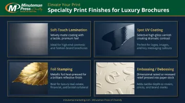
One or two of these finishes, applied with intention, elevates a brochure into luxury territory. All four together looks cluttered.
Getting those specs right before going to press matters. Minuteman Press of Chantilly works with agents across Northern Virginia, Chantilly, and the Washington DC market — providing modern offset printing on premium card stocks with the finish consistency that high-end listing photography requires. For agents preparing a luxury listing package, contacting their team directly for spec confirmation and a custom quote is the practical first step.
Smart Distribution for High-Net-Worth Buyers
Targeted Direct Mail
A premium brochure mailed in a branded envelope to a curated list of high-net-worth households creates a physical impression that digital channels can't replicate. According to NAR's direct mail research, 67% of consumers find physical mail more personal than digital alternatives — a meaningful advantage when reaching buyers who receive a high volume of digital communications.
Minuteman Press of Chantilly handles printing on premium stocks, processing, and direct USPS submission. Their minimum is 200 pieces — a practical threshold for targeting a specific luxury zip code or subdivision in McLean, Great Falls, or Georgetown. For agents who want to cover specific carrier routes without purchasing a list, their Every Door Direct Mail (EDDM) service handles it.
Open Houses and Private Showings
Leaving a stack of brochures on a counter is convenient — handing one directly to a buyer is different. That direct exchange reinforces the agent's professionalism and creates a personal moment around the listing that passive placement simply doesn't.
Luxury brochures should be pre-set at every showing — and personally presented where possible.
Brokerage-to-Brokerage and Concierge Placement
Key placement targets in this channel include:
- Buyer's agents at luxury brokerages in the market area
- High-end hotel concierge desks serving relocation clients
- Private clubs and lifestyle venues frequented by the target demographic
For DC-area listings, this distribution layer reaches buyers relocating for government, legal, or corporate positions — a substantial segment of the metro luxury market.
Integrating Digital Touchpoints
A QR code on the back cover or property page connects print to digital without requiring a separate search. In 2025, **93% of marketers increased their QR code usage**, and Uniqode reported that 9 in 10 consumers scan QR codes at least weekly. The link destination should be intentional: a 3D Matterport tour, drone video walkthrough, or private listing microsite.
The QR code should be designed into the layout from the start, not dropped in as a corner afterthought once everything else is finalized.
That same consistency extends to every contact detail in the brochure. The website URL, agent email, and phone number should match every other marketing touchpoint exactly. Sophisticated buyers cross-reference everything, and inconsistency across print and digital erodes trust fast.
Tracking brochure ROI is possible through digital integration:
- Unique landing page URLs per distribution batch
- QR code scan analytics (available through platforms like Bitly or Uniqode)
- Dedicated phone numbers by campaign
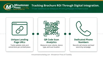
Each of these tools assigns a measurable signal to print distribution, so you can identify which batches drove engagement and refine future campaigns accordingly.
Frequently Asked Questions
What should be included in a luxury real estate brochure?
A high-impact hero image, key property specs (beds, baths, square footage, notable features), a lifestyle narrative covering neighborhood and amenities, a professional floor plan, and agent contact details with a clear call-to-action for booking a private showing.
What paper stock or materials are best for a luxury real estate brochure?
130 lb.+ card stock for the cover in silk or gloss finish, and 100 lb. silk or gloss text for interior pages. Soft-touch lamination on the cover and spot UV on hero images are the most effective specialty finishes for signaling luxury tier.
How many pages should a luxury real estate brochure be?
Typically 4 to 12 pages, depending on the property. More pages accommodate floor plans, neighborhood storytelling, and multiple photography spreads without crowding any individual layout. Ultra-luxury properties often justify 12–16 pages.
Do luxury real estate brochures still work in 2026?
Yes. According to the USPS Household Diary Study, print achieves 75% unaided recall versus 44% for digital advertising. A well-produced brochure also signals the agent's professionalism in a way no email or listing page can match.
How much should a luxury real estate agent spend on brochures per listing?
For listings above $1M, most agents budget $3–$8 per unit for premium stock and specialty finishes, with total print runs of 25–100 copies depending on distribution strategy. That cost is negligible against a commission at that price point, and buyers at this tier notice the difference in material quality immediately.
How can I make my real estate brochure stand out as a luxury piece?
Lead with professional photography, use a serif typeface and a restrained palette of black, white, and gold, build in generous white space, and add at least one premium finish — soft-touch lamination or spot UV. Done well, a buyer perceives the property's caliber from the cover before reading a single line of copy.