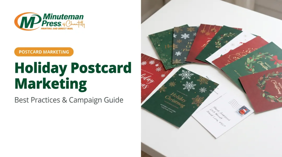
For small businesses working with tight budgets, a poorly designed postcard isn't just aesthetically disappointing. It's a wasted print run, wasted postage, and a missed opportunity to reach a warm local audience.
This article covers the essential visual design principles, copy strategies, size and stock selection, and the most common mistakes that undermine postcard campaigns before they reach the mailbox.
Key Takeaways
- Postcards demand instant clarity — no envelope, no click, just a few seconds to make an impression.
- Your front needs one bold visual, a punchy headline, and a clear offer — your back handles the details, contact info, and CTA.
- Choose postcard size and stock based on your campaign goals, not just your budget.
- Lead with customer benefits, not business features, and make your CTA trackable.
- Avoid the four most costly mistakes: low-res images, cluttered layouts, missing CTAs, and USPS compliance errors.
Why Postcard Design Matters for Small Business Marketing
A postcard has no barrier to entry. There's no subject line to click past, no envelope to tear open. The moment someone picks it up, your message is already in front of them — and you have roughly three seconds to make it count.
That immediacy is unforgiving. A strong postcard with a clear offer can prompt action before the reader has set the mail down. A cluttered one gets flipped over and dropped.
The Local Targeting Advantage
For small businesses specifically, postcards offer something digital channels genuinely struggle to match: precise geographic targeting without a complicated ad setup. Through USPS Every Door Direct Mail (EDDM), businesses can target entire postal routes in their service area without purchasing address lists or individual stamps — a practical fit for neighborhood restaurants, local service providers, and brick-and-mortar retail.
The cost-per-impression math also tends to favor postcards over paid digital for local campaigns. You're not competing in a real-time auction; you're delivering a physical object to a defined geography. That advantage only holds, though, if the design is strong enough to earn attention.
Design Quality Is a Business Outcome
Poor design wastes the entire investment — print costs, postage, and the time spent building the list. Weak execution doesn't just reduce response rates — it can actively damage brand perception before a prospect ever contacts you.
The difference is visible at a glance:
- A professionally designed postcard communicates that the business is credible and worth calling
- A sloppy layout — low-resolution images, crowded text, no clear offer — suggests the same about the business itself
- Consistent, polished design builds recognition across multiple mailings over time
Core Visual Design Elements for Small Business Postcards
The front of a postcard has one job: stop the reader long enough to deliver the offer. Every design decision should serve that goal.
Lead With One Dominant Visual
The most effective postcard fronts feature a single dominant image: a photograph, illustration, or typographic treatment that communicates the offer at a glance. One strong visual beats three competing ones every time.
For that image to hold up in print, it needs to meet production minimums. PrintPlace specifies that 300 DPI resolution is required for crisp, clear printed output — anything lower risks printing soft or visibly pixelated. When pulling stock images, check the resolution before downloading; what looks sharp on screen often falls short at print size.
Color Strategy
Color does more than make a postcard look attractive. It carries emotional weight and signals professionalism. A few practical principles:
- High contrast is non-negotiable — dark text on a light background (or vice versa) is readable at arm's length; low-contrast combinations are not.
- Use brand colors consistently — off-brand palettes make a business look disorganized.
- Match color to campaign tone — warm reds and oranges for urgency, blues and greens for trust and calm, earthy tones for warmth and seasonal messaging.
Typography That Works at Print Size
Limit typefaces to two: one for headlines, one for body text. More than that creates visual noise without adding meaning. More critically, test your font sizes at actual print dimensions before finalizing the file — what reads easily on a 27-inch monitor can become unreadable on a 4"×6" card.
Your headline should be legible in under two seconds. If it requires a second look, the design isn't doing its job.
White Space Is a Design Tool
Overcrowding is the most common postcard mistake small businesses make. Filling every inch of available space doesn't add value — it reduces it by making everything compete for attention equally.
Deliberate white space:
- Guides the eye toward the most important element
- Creates a visual hierarchy between headline, image, and supporting text
- Makes the card feel professional rather than cluttered
Brand Identity Placement
Every postcard needs three identity anchors:
- Logo — place it on the front or back, not competing with the main visual
- Brand colors — consistent with your other materials, not a one-off palette
- Contact point — at minimum, one of: website, phone number, or social handle
Size your logo to be noticed, not dominant.
Consistent branding across all postcards, even seasonal ones, builds recognition. A customer who receives three well-branded postcards from the same business starts to expect, and look for, the next one.
Writing Postcard Copy That Drives Action
Lead With Benefits, Not Features
Most small businesses write postcard copy from their own perspective. The result is copy that describes what they do rather than what the customer gets.
| Feature-first | Benefit-first |
|---|---|
| "We offer 10-year roof warranties" | "Stay dry for a decade — guaranteed" |
| "Licensed and insured HVAC services" | "Never sweat through another August breakdown" |
| "Same-day appointment availability" | "Seen today. Problem solved today." |
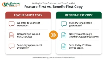
Readers make snap decisions based on self-interest. Tell them what changes for them, and you keep their attention for the next sentence.
Headline First, Everything Else Second
The headline carries the most weight of any copy element on the card. It should communicate the core offer clearly and speak to a specific pain point or desire.
It also needs to align with whatever visual is on the front. A headline and image that tell different stories split the reader's attention — and lose it.
Keep headlines specific — "Summer Sale" is weak. "30% Off Every Service Booked in July" gives the reader a reason to keep reading.
Make the CTA Trackable
A postcard without a clear next step is a missed opportunity. The CTA should be:
- Specific — not "Call us" but "Call by Friday for 20% off your first visit"
- Prominent — placed where the eye naturally lands on the back panel
- Measurable — so you can evaluate the campaign's performance
USPS outlines several tracking methods for direct mail — QR codes tied to a unique landing page, personalized URLs (PURLs), dedicated phone numbers, and promo codes — each one tying responses directly to the postcard.
Front/Back Discipline
- Front: Lead with the headline, dominant visual, and a stripped-down version of the offer — nothing else competes for attention
- Back: Layer in supporting details, contact information, the full CTA, and — for direct mail — the address panel and postage area
This division keeps the front visually clean and gives readers who flip the card everything they need to act.
Choosing the Right Postcard Size, Stock, and Finish
Size Selection
| Size | Best Use | Postage Note |
|---|---|---|
| 4"×6" | High-volume campaigns, budget-conscious mailings | Qualifies for lowest USPS retail postcard rate ($0.61 as of April 2026) |
| 5"×7" | Mid-range campaigns, added visual space | Letter postage rate applies |
| 5.5"×8.5" | Balanced visibility and cost | Letter postage rate applies |
| 6"×9" | High-impact campaigns, competitive markets | Letter postage rate applies |
| 6"×11" | Maximum visibility, premium offers | Letter postage rate applies |
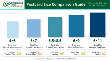
Larger formats stand out more in a mailbox. Whether that visibility gain justifies the higher postage cost depends on your offer value and campaign goals.
Minuteman Press of Chantilly offers all five of these standard sizes, with templates available across 16 industry categories — a practical starting point for small businesses that want a polished design without starting from a blank page.
Paper Stock
Heavier card stocks signal quality the moment someone picks up the card. Common options range from lighter coated stocks to 14pt, 16pt, and heavier coated cover stocks — with 16PT being the thickest and most rigid choice for premium campaigns.
A practical guide:
- Lighter coated stock — solid for high-volume, budget-conscious campaigns
- 16PT gloss or silk — adds perceived value for premium services and high-ticket offers
- Uncoated stock — the only writable option for RSVP cards or handwritten-response mailers
Minuteman Press of Chantilly carries options from 100# uncoated cover through 16PT C2S gloss and silk.
Finish Options
- Gloss UV coating — enhances color vibrancy, protects the card through postal handling; strong choice for most direct mail
- Silk/soft-touch — tactile, refined feel without high shine; well-suited to wellness, luxury, and lifestyle brands
- Uncoated — writable surface, professional matte appearance; appropriate when recipients need to fill something in
Minuteman Press of Chantilly offers UV coating on the front side, which creates a polished front presentation while leaving the back uncoated for mailing requirements or handwritten notes.
Common Postcard Design Mistakes to Avoid
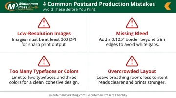
Production Errors
These mistakes don't just reduce effectiveness — they can result in unusable files or wasted print runs:
- Images below 300 DPI print blurry or soft — check resolution before uploading
- Files without a 0.125" (1/8") bleed on all sides will show white edges after cutting
- More than two typefaces or four colors creates visual chaos; keep it disciplined
- Overcrowded layouts dilute every message; pick one thing to say and say it clearly
Messaging Mistakes
- Writing for the business, not the customer
- Using industry terminology your audience doesn't share
- Including multiple offers on one card (one campaign, one offer, one CTA is the rule)
- Skipping a deadline or urgency element that gives readers a reason to act now
Even a well-written card can fail at the mailbox if it doesn't meet postal requirements.
USPS Compliance Issues
Postal compliance mistakes can cost extra postage or cause pieces to be rejected in processing. Key rules:
- Keep the address panel, postage indicia, and barcode clear zone — typically the lower-right quarter of the back — free of design elements
- Maintain the minimum card dimensions specified in USPS Postal Explorer QSG 201: at least 5" long, 3.5" high, and 0.007" thick
- Odd shapes or non-standard dimensions trigger surcharges or automation penalties
USPS Delivers notes that address mistakes and misplaced mail markings are among the most common direct mail design errors — consulting a Mailpiece Design Analyst before finalizing your file can prevent costly reprints on large campaigns.
Conclusion
Effective postcard design earns its keep through response, not just looks. A visually bold front, benefit-driven copy, a specific trackable CTA, and technically sound print specs all work together to convert an affordable marketing channel into measurable results.
For small business owners who want professional postcards without the design complexity, Minuteman Press of Chantilly covers the full process. Their catalog includes customizable templates across 16 industry categories and professional design assistance for custom work.
Orders are printed on quality card stocks using offset printing, with doorstep delivery or free 24/7 kiosk pickup — so a good idea moves quickly to a finished piece in the mailbox.
Frequently Asked Questions
What are common postcard design mistakes?
The most frequent errors are overcrowded layouts, low-resolution images (below 300 DPI), missing or vague calls to action, and file setup problems such as missing bleed. Inconsistent branding and USPS compliance issues — like design elements placed over the barcode or address zones — round out the list.
How much does it cost to print 1,000 postcards?
Pricing varies by size, stock, finish, number of sides, and turnaround time. Cost drivers matter more than a single number: larger sizes, heavier stocks, specialty coatings, and faster turnarounds all add cost, while higher quantities reduce the per-unit price significantly.
What postcard size works best for small business marketing?
The 4"×6" format is the most cost-effective and qualifies for the lowest USPS retail postcard postage rate. For high-value offers or competitive markets, a 5"×7" or 6"×9" card provides more visual impact and justifies the additional cost.
What should go on the front vs. the back of a postcard?
The front carries the dominant visual, headline, and core offer — minimal copy. The back holds supporting details, contact information, and the full CTA. For direct mail pieces, it also includes the address panel and postage area.
Should I use gloss or matte finish for my postcards?
Gloss UV coating enhances color saturation and holds up well through postal handling, making it the practical default for most campaigns. Matte or silk finishes deliver a premium, tactile feel better suited to upscale brands or lifestyle-oriented offers. Match the finish to what your brand communicates.